Case Study
Casa Branco
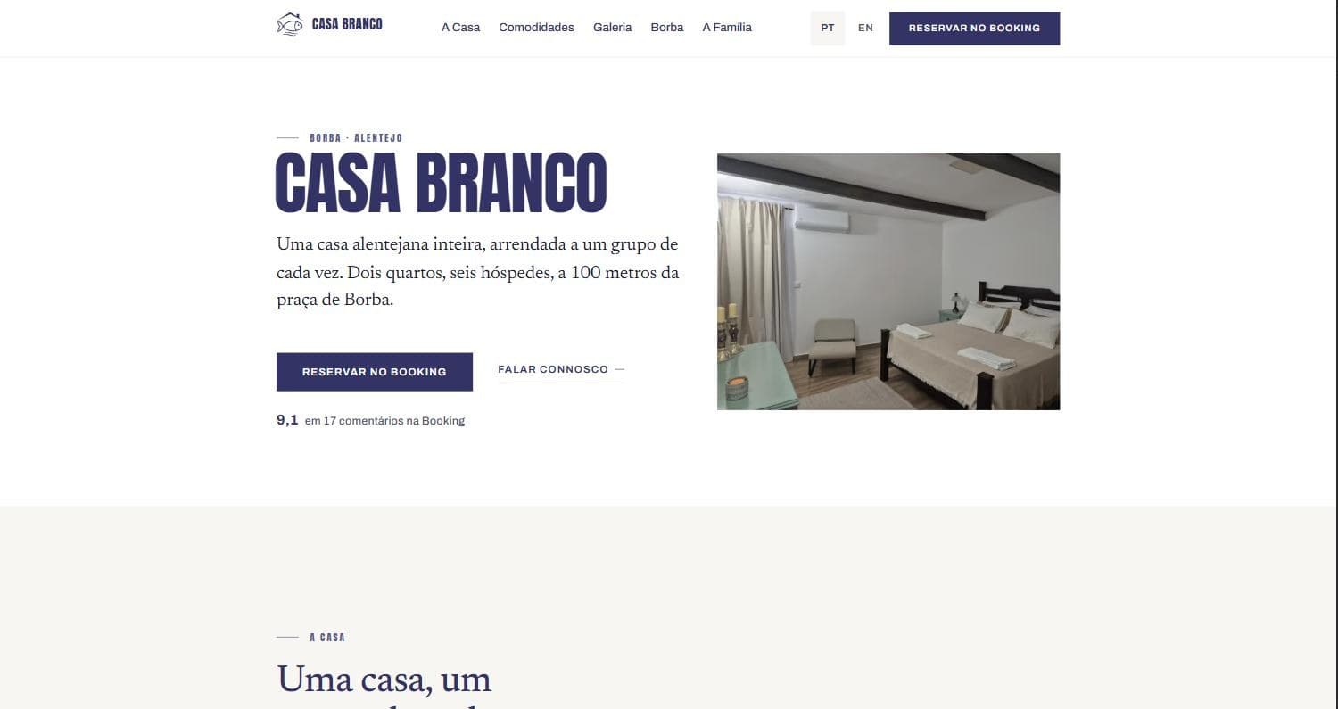
A bilingual site for a family guesthouse in Borba, Alentejo: one anchored page in Portuguese and English, plus house rules and privacy. It deliberately takes no bookings — it hands the visitor to Booking.com, and the click on that button is the only conversion worth measuring.
The problem
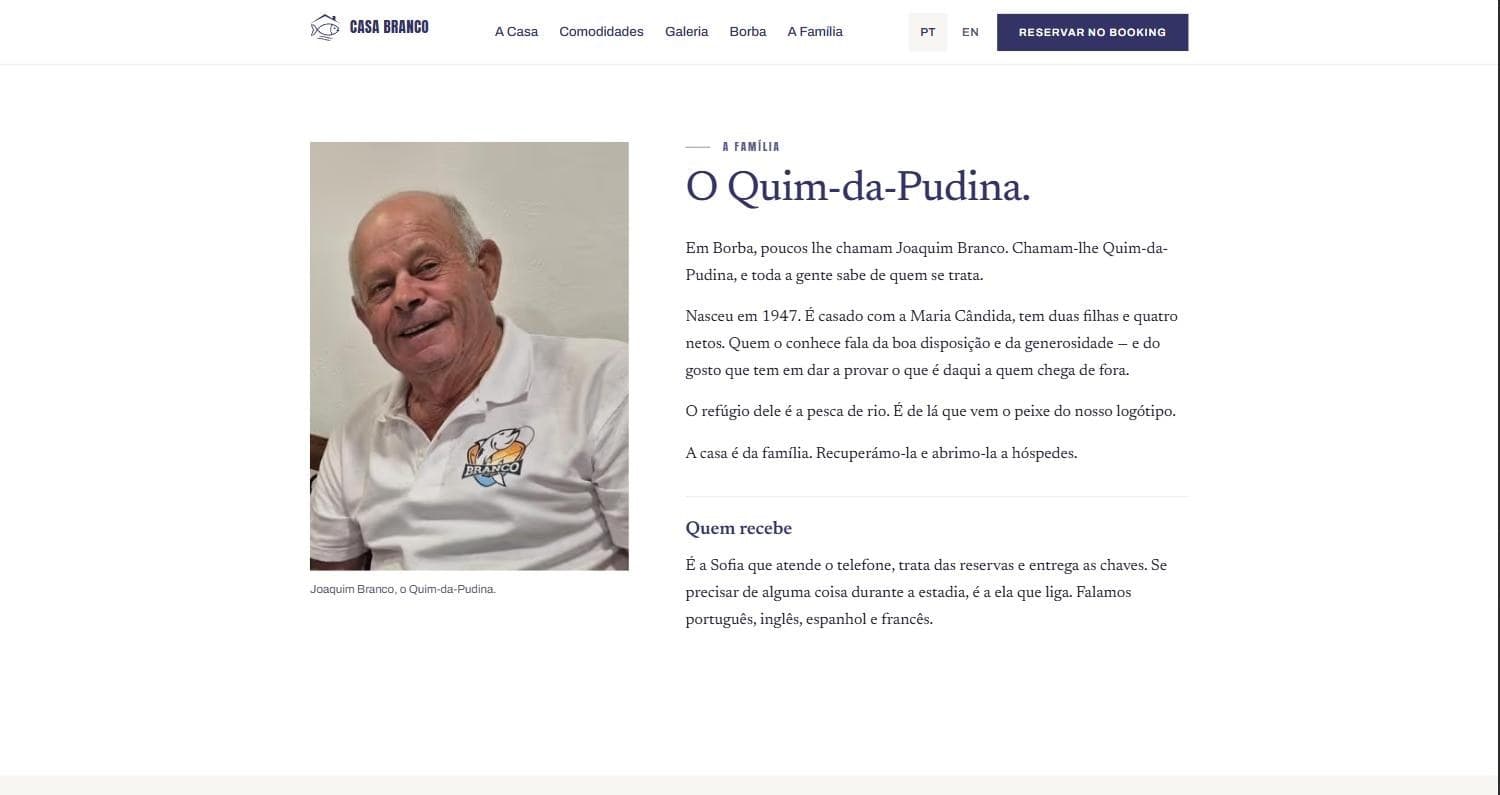
The house is new and had nothing but a platform listing — a page that ranks for the platform, not for the house, and that carries none of what actually makes someone choose it. What was missing was the part a listing can't hold: Joaquim Branco, known in Borba for eighty years as the Quim-da-Pudina, his river fishing, and the reason there's a fish in the logo.
The constraints came from the client, not from me. The owner isn't technical and needs to change a price or a photo without a developer. The guests search on a phone, and a good share of them are Spanish or foreign, so the site has to be genuinely bilingual — not a half-translated second version that quietly falls behind.
Key decisions
Every word out of the markup
All the copy, prices, photos, alt text and contact details live in typed files under a single content folder. There is no text written inside a component anywhere in the project, so changing a sentence means editing one line of data — which is what makes the handover to a non-technical owner realistic instead of theoretical.
Portuguese is canonical, and the compiler enforces the pair
The English dictionary is typed against the Portuguese one, so adding a key in Portuguese and forgetting to translate it fails the type check. The two languages cannot drift apart without someone noticing, which is exactly how bilingual sites usually rot.
A validator, not a checklist
One command builds the site and asserts 34 things about the output: structured data in both languages, meta tags, exactly one heading-one per page, and that every translated URL is properly paired in the sitemap. For a guesthouse, structured data is where local search actually happens — and it's the kind of thing that breaks silently.
Photos capped at what the source can honestly carry
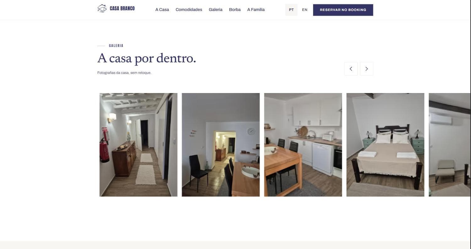
The only material available is screenshots from the platform listing, none wider than 1024 pixels. Rather than let a template stretch them into mush, the display ceilings are design tokens: no photo is ever rendered larger than it can fill. When there's a real photo shoot, the ceilings move in one file.
No analytics, no third parties, no cookies — and the policy says so
Fonts and images are served from the site's own domain; the page ships no client JavaScript beyond the gallery. The privacy policy claims exactly that, which has a useful consequence: adding an analytics script later becomes a deliberate content change, not something that slips in and quietly makes the policy a lie.
Stack
Astro 5 with static output on Vercel, TypeScript for the content layer and its bilingual contract, sharp for generating favicons and social images from the logo, and self-hosted fonts — no external requests at runtime.
The result
Live in production at 97 / 100 / 100 / 100 on mobile Lighthouse, 309 KB, no layout shift. The house has a page that ranks for its own name, tells the family's story, states the stairs-only access plainly instead of hiding it, and hands the visitor to Booking in one click — and the owner can change a price or a photo without opening a component.
In the wild
Contact
Let's build something together.
Have a project in mind, or just want to say hi? My inbox is always open — I usually reply within a day.
Open to internships & freelance